How to Mix and Match Patterns Like a Pro: Easy and Stylish Tips
The Impact of Texture in Mixing Patterns
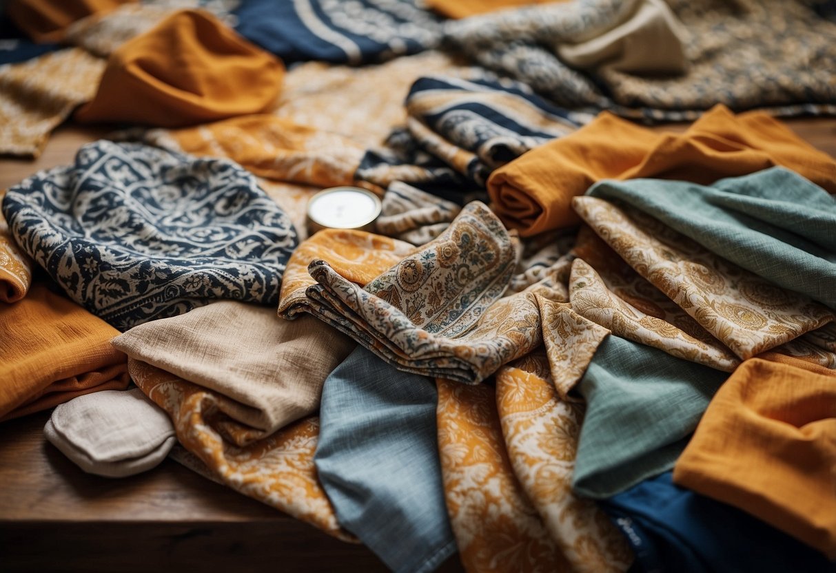
Texture significantly influences how patterns interact in an outfit. Mixing patterns becomes much more interesting and dynamic when you consider the textures of the fabrics involved.
Combining a rich velvet with a smooth silk can create a striking visual contrast. On the other hand, pairing a rough tweed with a finely woven cotton can give depth to the ensemble.
Patterns on textured fabrics often appear more nuanced. A floral motif on a satin dress looks different from the same motif on a knitted sweater. This difference impacts the visual weight and balance of your outfit.
Lighter textures like silk or chiffon can sometimes soften bold patterns. Heavy textures like wool or corduroy can anchor more delicate prints, adding structure.
Texture can also influence the perception of color within patterns. The same color can appear differently on a matte fabric versus a shiny one. This change can affect how patterns blend or clash with each other.
Consider the season when mixing textures and patterns. Heavier fabrics like wool are more suited for colder months, while lighter fabrics like linen are better for warmer weather. Keeping the season in mind ensures both aesthetic harmony and comfort.
Confidence comes from understanding how textures and patterns interplay. Experimenting with different combinations is key to mastering this technique.
Mixing Patterns in Graphic Design
Effective mixing of patterns in graphic design can enhance visual appeal and clarity when approached correctly. Both digital and print media offer unique challenges and opportunities in pattern integration.
Digital Design Tips
In digital design, patterns often serve functional and aesthetic purposes. Designers should consider screen resolution and responsiveness. Patterns that look good on a desktop might need adjustments for mobile devices. Think about spacing and scale; too large, and the pattern might overwhelm, too small, and it might lose definition.
Color theory plays a significant role. Complementary colors can make patterns pop, while analogous colors create a more seamless blend. Patterns must align with the project’s theme and target audience, ensuring they add rather than distract attention.
Using vector graphics for patterns can maintain quality across different devices and sizes. It’s crucial to test patterns on various screens to ensure they maintain their effectiveness and appeal.
Print Media Considerations
When working with print media, designers must account for different factors such as paper quality, printing methods, and color accuracy. Patterns in print can lose detail or clarity if not properly managed. High-resolution images are essential to prevent pixelation and maintain crisp lines and details.
Choosing the right paper type can influence how patterns appear. Glossy paper can enhance vibrant colors, while matte paper might suit subtler designs. The Pantone Matching System (PMS) ensures color consistency across various print runs.
Consulting with the printer early in the process can avoid potential pitfalls. They can provide guidance on the best practices for pattern printing and help troubleshoot any issues that might arise.